After speaking with Chris he provided me with extra issues/problems (during my interview) that he knew of within the village which if I wanted to I could focus on to produce a design solution. He emailed me with a review.
Alongside my speeding design solution I came up with combining his idea 1 and 3 of producing an infographic that would 1) show the speeding limits within the village and where they are which will educate and inform people, and 2) show the main attractions of the village. Which in combination the infographic is more of a fun, educational poster rather than turning the village board into something being serious which will prevent people looking at it.
In order to help raise awareness for speeding within my community village (Bourton On The Hill) I wanted to produce a infographic that could be put on the village board which meets the needs of my target audience being two separate demographics.
Locals who drive through regularly
People that are not familiar with the road/village – new comers
After experimenting with what to include on my infographic I then realised I didn’t apply any popular places within my village that people would want to know or be interested in.
To make my infographic the most similar representation of my village I dissected the main road that runs through my village so people can understand more where specifically the different speeds are and what the roads look like.
This helps to meet my target audience of people coming through the village rarely, or for the first time.
Hierarchy
When designing my infographic I ensured to use visual hierarchy to guide the eyes and tell the viewer where to look.
Aspects I focused on
Meaning
How I applied it to my infographic
COLOUR
Bright colours are attention seeking so it attracts the eye
The images below are the village notice boards – we have two in the village. One outside a bus stop and the second is outside the village hall (which people notice more).
A prototype
I wanted to see what it would like like being added to the village board, so due to not being at home I added what I created onto a picture of the board for an example which I could work with.
I sent a copy (via email) of what I produced to Chris to gain feedback.
Thinking about speed awareness I thought it would be important to research existing designs that are available to us already.
I firstly created a Pinterest board which I could visually refer back to and gain initial ideas from. My Pinterest boards mainly consist of campaigns which allows me to think about the different topics of driving and how people portray them with the objective of change.
I think all the above are fun but would they help to make people aware of their speed? no, I doubt it.
One aspect that I have been thinking about regarding driving is how us drivers always notice and obey road markings examples (shown below). Once we see a give way sign (3) we know to stop and everyone does it because we know there is traffic ahead.
At a roundabout (1) usually people obey the white circle and go around it, but when we are a approaching a roundabout without a sign and see the white markings on the road we are aware that it is a roundabout and to treat it as a roundabout.
123456
Image 5 is the strongest example of using a simple design such as a white line to make us aware of our spacial awareness, and safety. The line ensures we stay on our side of the road so we don’t drive in the middle of the road, it directs us.
Image 6 is also a great example of using symbols on the road, without having to use signs it tells what direction to go. I have always got very anxious driving up to a roundabout and there are no signs directing me which lane I should be in but then when I see there are directions on the road telling me which lane I should be in (white arrows) it gives me comfort and directs me to the correct lane, making it easier and less aggravating for people.
Regarding image 5, the Independent published an article talking about how removing white lines may impact the speed (decreasing) of motorcyclists.
Removing white lines on roads strive to slow drivers down as having blank roads cause uncertainty and which as a result make motorcyclists slow down (Austin , 2016).
Trial
Transport for London (TfL) carried out a trial on three stretches of road that showed removing the central white line causing the reduction in vehicle speeds.
“Centre lines can provide a psychological sense of confidence to drivers that no vehicles will encroach on ‘their’ side of the road.”
TfL
“Safety benefits to be gained by removing centrelines in 30mph zones”
(RSGB)
When reviewing my village, we don’t have a white line when you get to the middle of the village whichnarrows, but we have dragons teeth which provides people with the effect of road narrowing, encouraging drivers to focus and slow down.
The use of dragons teeth and no white line used in our village has no effect. So relating to the TfL trial our village does not support the positive outcome of reducing speed that the trail had. Having no white line could be an influence for the issue of speeding in our village.
Decoding Road markings
In relation to my first brief/project of exploring the different aspects of design I applied the same technique to understand the purpose of road markings.
Looking at the images below helps me to understand the power of just using simple symbols, typography and colour to direct and inform people of rules.
1234
Parking spaces help people obey the correct way of parking. Parking is a great example of my issue. You can put things in place to help change people’s behaviour but you will never solve it for everyone. There will be people that abide to it and others that don’t.
The image above demonstrates how having road markings influences peoples behaviour and change their actions (well for some). It ensures people park within the lines.
I want to use a similar approach which would make people think of their speed, for example a simple white box makes people fit their car within the space to ensure correct positioning of their car when parking.
So, how could I try get people to obey the speed limit?… what symbols could I use or create.
This made me think about whether there are any hidden symbols which could be re designed to be a more suitable choice for the roads which would make people slow down.
I first added the Mercedes brand logo on the side of the road and made it go alongside the road to give the impression the road is becoming narrower and usually that slows people down. I then added a white line just for experimentation as just having the Mercedes logo either side was not effective enough.
The overall look (to me) like steps, it gives the road an illusion of boxes/steps which I think works well. It would be used to distanced cars.
I then added the same design to the road outside my house which is the targeted area I am focusing on.
I changed the colour from a white line to the traffic coding system to visually portray red is too fast, amber is getting better and green is a good speed which is the correct speed that person should be going.
Everyone will know the colour system so they will be able to think about their speed.
To explore whether the 2 chevrons work for people I created a poll on my instagrams to gain feedback on whether people follow the rule and whether it changes their driving behaviour.
I received two different audiences, people who follow my photography (below).
People who follow my personal instagram account.
The results support my theory of how everyone notices things that are shown on the road, which means when thinking about targeting people and to make them think it will be more beneficial if it is on the road.
2. Materials
When walking back to my flat I saw this Vancouver on the pavement and it made me think about hostile design.
Due to the bumps sticking out it makes it uncomfortable to walk on. I wondered whether it would be a good design to have a line with a similar appearance/material.
Going back to people not wanting to damage their cars, it would make people slow down as h=they know it could be a risk to their tyres.
When looking at this image gave me the idea of using cracks for an installation whilst driving to reduce speed.
My idea is based on while driving on the road, the faster your speed the more and quicker cracks appear on the road, so the only way to stop the cracks from appearing as quick is to slow down. I feel as if this would be a great way to make people aware of their speed.
There would be a sign before to allow people to be aware.
An example which relates to this is;
Rumble strips used.
“Fun experiment to change social behaviour” – the goal of the rhythmic road to help drivers stay focused.
Requires you to drive the approbated speed limit (45ph).
This image provided me with the idea of making fake scenarios.
Well known designs/colours and patterns
When walking to the gym, an ambulance was outside of a house and it made me think about how police have the same sort of design and whenever we see a police car on a motorway or road we instantly are more cautious and slow down because they are police.
This made me think of what if there was a box or cube that is in villages which once a drivers sees it they associate it with the police and will slow them down instantly.
To demonstrate I used this ambulance but the final design would be police.
4. Keeping it personal
When I was out I came across the images below. There were free wheels outside someone’s place which made me think about what if I were to put personal objects along the side of a road to get people thinking about death and the consequences of their actions.
Common things that are usually seen relating to road deaths are like the images below.
I came across this image and what instantly caught my attention was the boot. I always think about whenever there is a car crash what really makes it a reality is the belongings people have.
If I was driving and saw a car crash like this with peoples belongings in the back it would hit home and make me upset because their real people.
Thinking about this more made me think of in summer when I visited a memorial in Belgium when walking around there were objects on top of specific names on the tombstones. Which to me, I felt as if each family member paid their respect and the way they connect with their dead loved one is with a personal object that reflects that person.
5. Community speed camera fashion
I had the idea of designing a yellow case/cover for the community speed camera as if people saw that it looked like a generic yellow camera they would slow down. Only issue is, the signage and lack of the typical road markings on the road showing people its a speeding camera won’t be allowed as its not a speeding camera, its a community one.
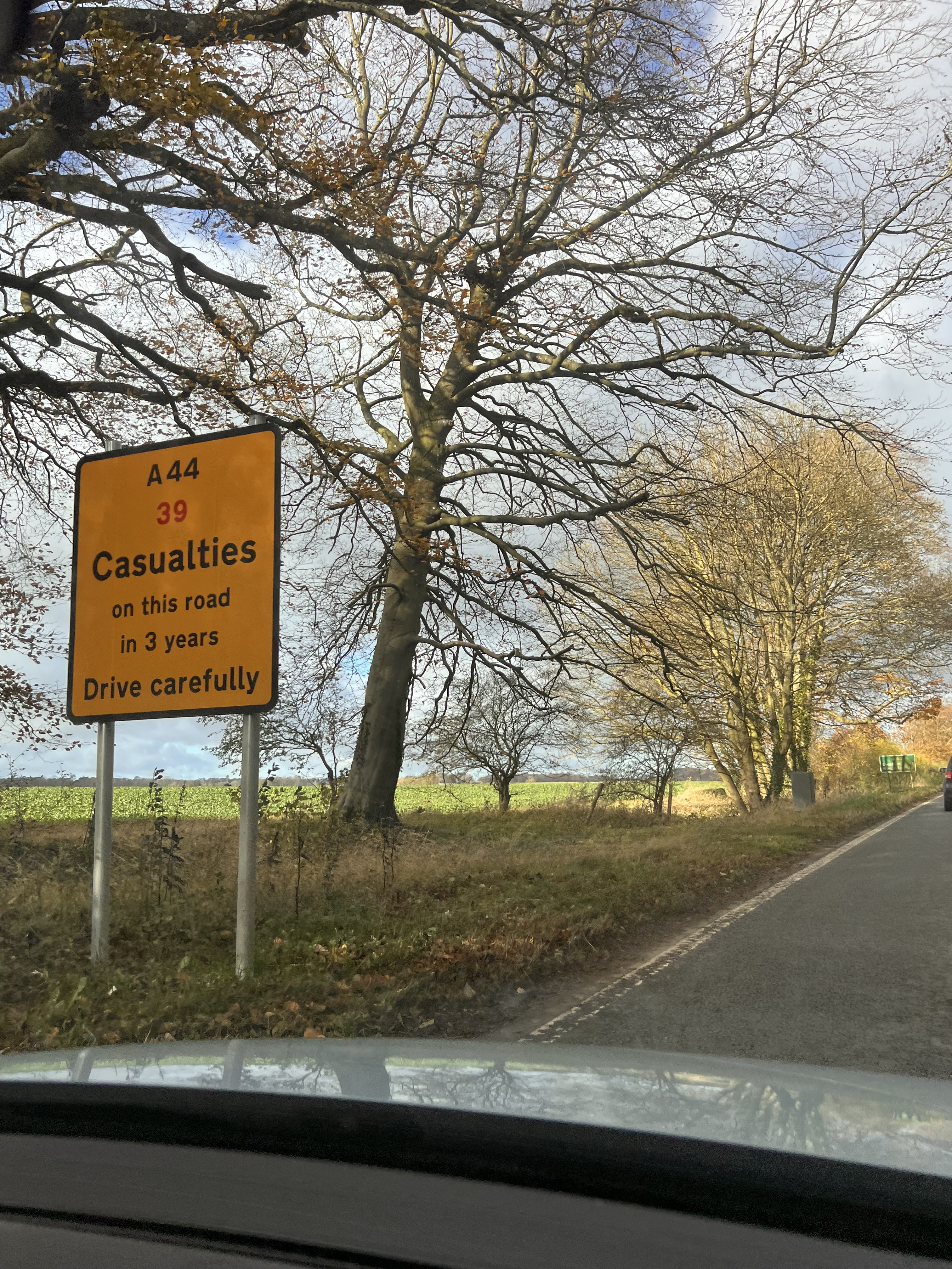
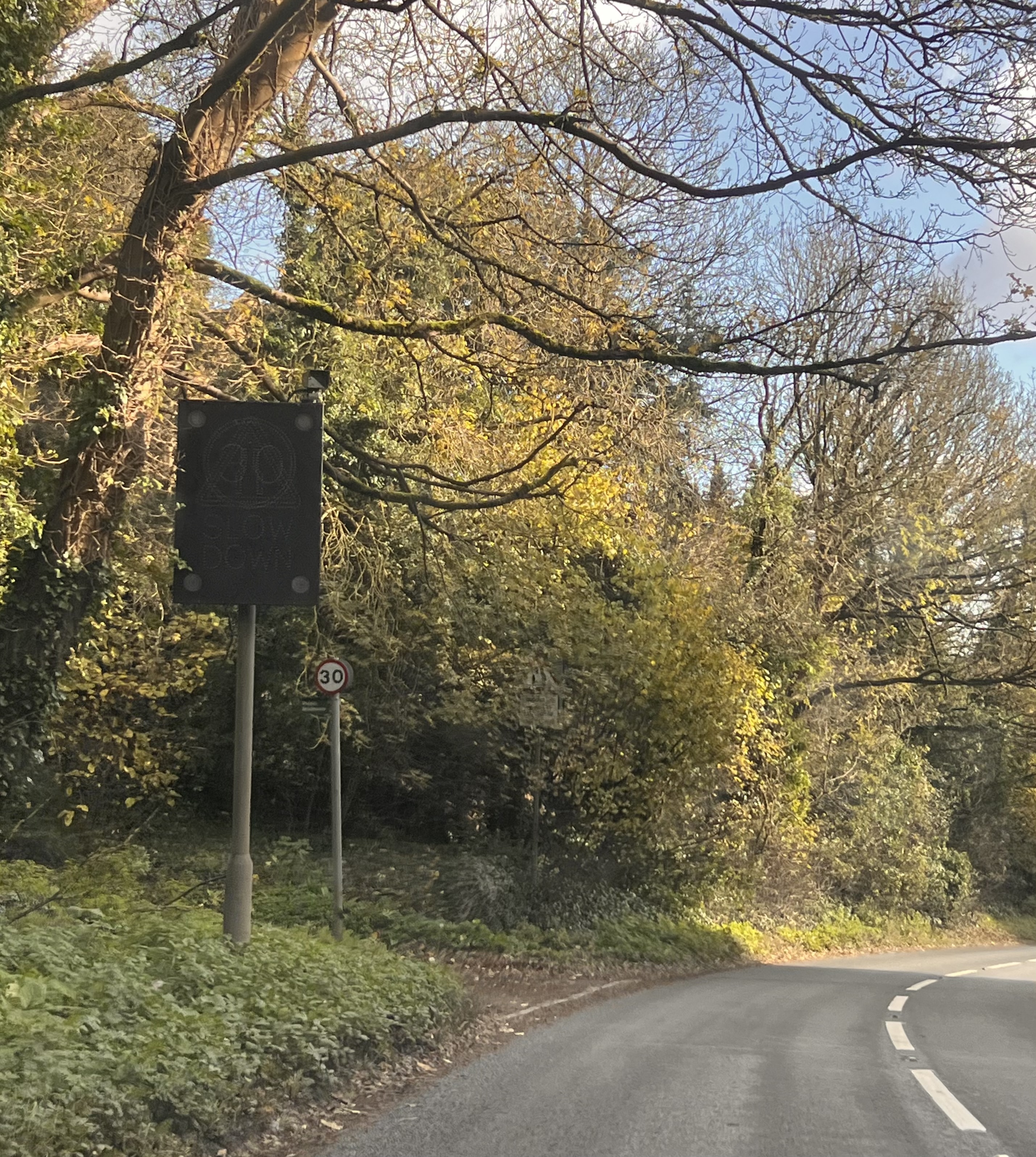
When going home for a hospital appointment I took the time to take photos of existing speed awareness designs that are currently near and in my village. I would not of ever thought about this without learning and researching about nudge design or my perspective being challenged about behavioural economics regarding changing people’s behaviour.
The images below show the nudge design that is on the road above where I live, they recently have put it up, as you can seen there are several all along on a main road. Originally I thought they were useless as if your going at high speed who will pay attention to them, but when having a conversation to my client about the signs he was trying to remember what word was used to describe the deaths and I knew it was casualties so the sign obviously had an impact on my memory which showed me that I obviously without knowing did look at the sign and pay attention to it.
This then made me think about the three levels of awareness as do people know they are looking at the sign without knowing or do people go out their way to look at the sign.
We looked at this during Martin’s Lecture but I needed to expand my knowledge and carry out more research to fully understand.
Conscious mind
Preconsious mind
Unconscious/subconscious mind
We are aware
Not currently aware of but can be brought to consciousness
Primary source of human behaviour
Thoughts Memories – easy to retrieve Feelings
Anything that can be brought into the conscious mind
The part of the mind of which you can’t see
Mental processing that allows us to talk and think about logically
Thoughts Feelings
Not thinking about your phone number but then when someone asks you can recall it with ease.
Forgetting to grab cheese during a grocery trip until you see a sign that advertises a half-off cheese sale
Breathing.
We don’t have to think about breathing, but we can change how we control our breath and its pattern
(Peer, 2022)
So…. which one do we use while driving??
Driving combines the conscious and unconscious/subconscious brain activity.
Behaviour is driven by the Subconscious mind (right side of brain).
Conscious mind
Subconscious mind
When you are new to driving your focus is aimed at your car’s gear and clutch
Once you have been driving for awhile ad become more skilled your subconscious mind records your actions and you drive without making conscious effort
You notice every pothole, every bump or obstacle
You change gears automatically Listen to music while driving Talking on the phone
Driving is routine for us, but we can change our speed and the safety of ours by preventing accidents and dangers occurring
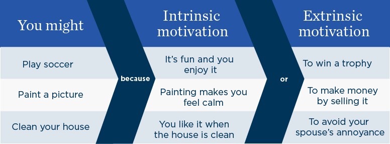
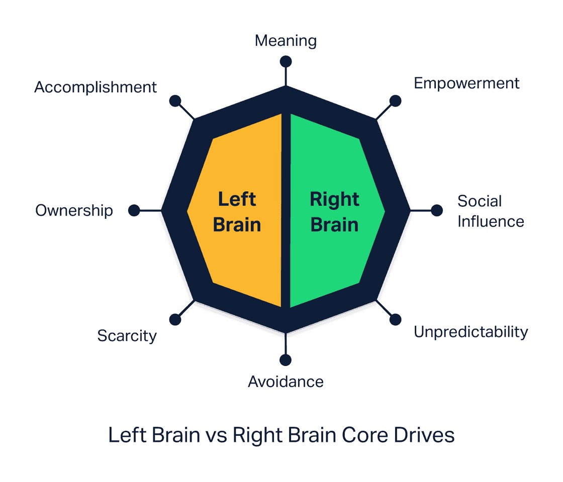
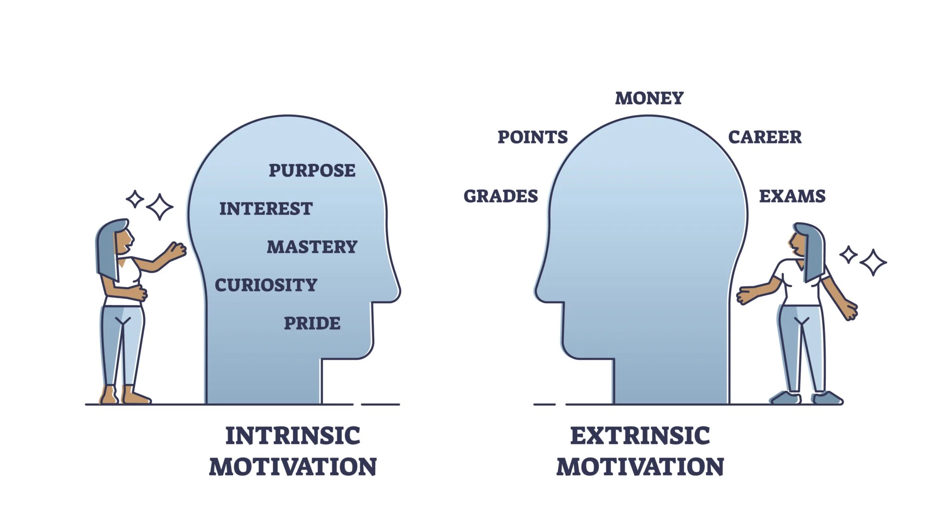
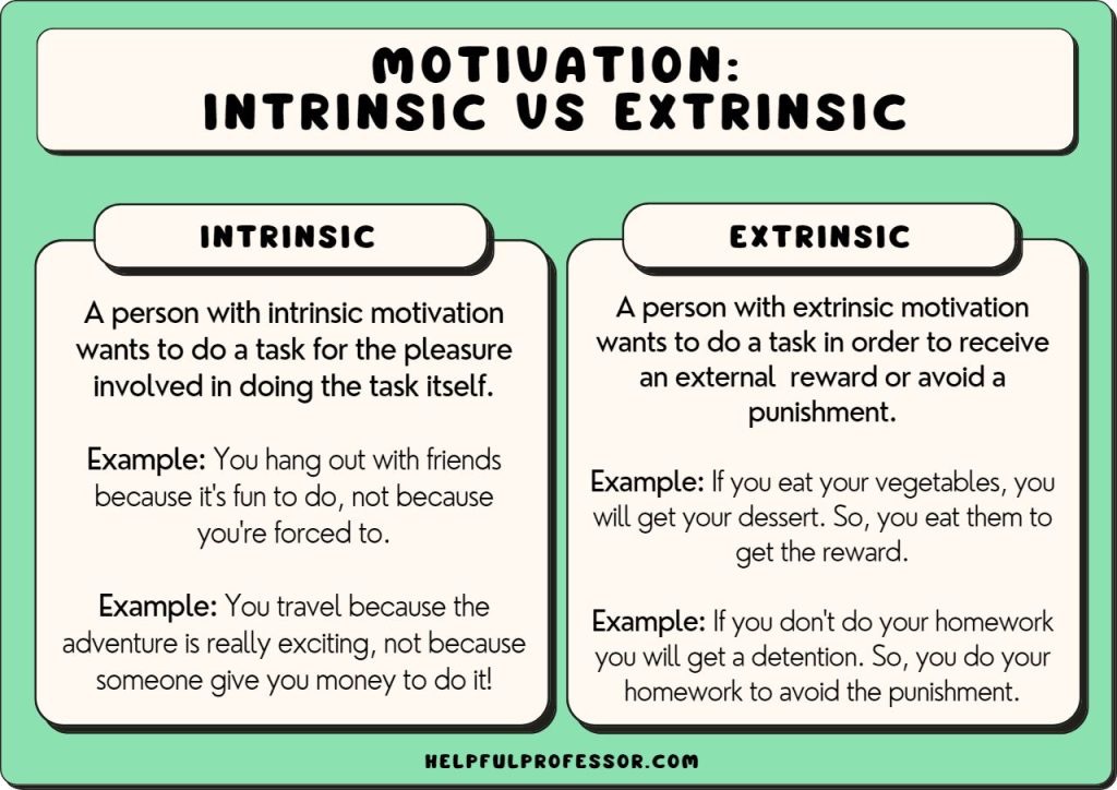
Intrinsic and extrinsic motivation
Extrinsic
Intrinsic
Persuades behaviour through external rewards
Involves doing something in spite of there being no obvious external rewards
Discourages behaviour through punishments
Arises from influences, incentives
(Welsh , 2023)
Speed enforcement is basically an extrinsic motivational approach. The fear of punishment (external factors) change driver’s speed behaviour.
Example
The combined influences of new laws, police enforcement and public communication campaigns have made more drivers worldwide aware of have accepted the rule ‘no drink and driving’ which is now perceived as normal. It’s not a new rule to anyone. This is a positive development towards an intrinsic motivation.
Example of extrinsic motivation: Reducing alcohol consumption to avoid getting arrested for drunk driving.
European Commission stated;
‘More information about the effect of speed on crash and crash severity may help to increase the intrinsic motivation to comply with the speed limit’.
The quote above has got me thinking about the importance of researching the relation of effects on speed and crashes.
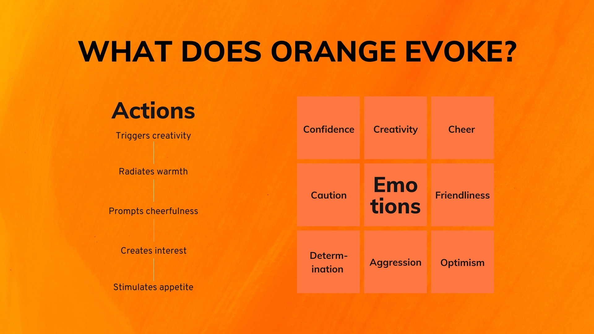
Colour psychology
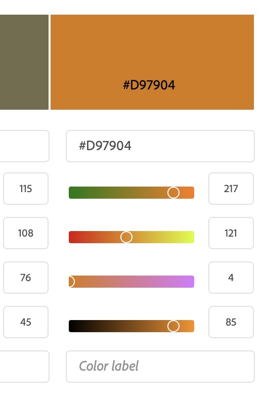
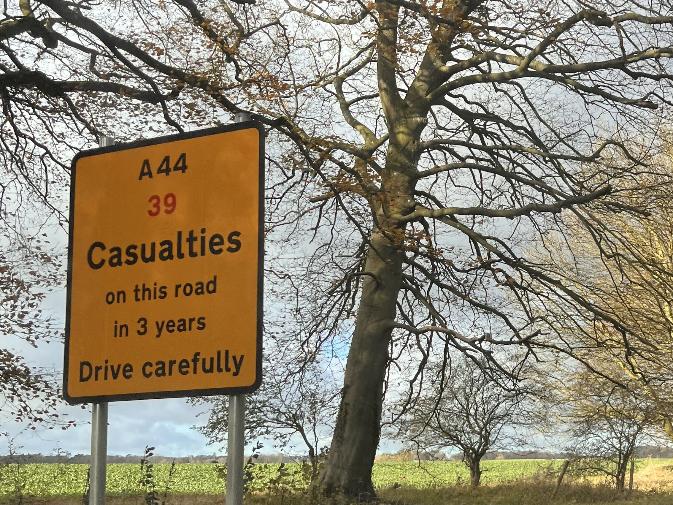
When thinking about the colour below used for the sign I wanted to know why the sign was designed to be that specific colour so I researched the actual colour which was #D97904.
Colours cause an emotional response. The sign is communicating the amount of deaths, which as a topic is upsetting and emotional.
The colour psychology of orange relating to the sign I saw (shown above).
Associated with the colour orange
Description
Stimulation
Visually stands out
Attention grabbing
Positivity
The colour psychology of orange representing positivtiy compared to the sign communicating deaths creates an impactful design communication message.
Pride
the colour orange representing pride is also an effective choice for a road sign showing a number of deaths as it communicates that also drivers being pride before safety has the consequence of death as well.
Impatience
The text showing causalities supported by the colour psychology of orange communicates drivers have been killed as a consequence of impatience.
When thinking about the combination of black (the information) and the orange (sign colour) evokes sadness, decay, and death (Cherry, 2023). Which looking at the sign the colour scheme supports the visual message and communicates the topic of death effectively.
The reason why I could remember the number of causalities is due to the different colour used for the number. As you can see the number shown is in red which makes it stand out more.
I wouldn’t think of the combination of red and yellow orange together would be a good choice due to the lack of legibility, so I thought it would be interesting and important if I were to research this.
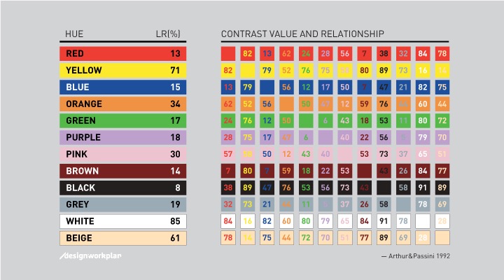
Arthur & Passini reported in their book of way finding a reliable calculating method to calculate the contrast difference between two colors.
When the brightness differential is 70 percent or higher the legibility is strong.
Less than 70 percent, the legibility is weak and those colors shouldn’t be combined.
As we can see using orange and red isn’t appropriate (62), but using yellow and red is appropriate (82). I would argue that the colour of the sign is a combination of yellow and orange and due to that combining red with the yellow orange colour of the sign means it is legible due to the percent is higher than 70 percent.
Research also showed me that I was correct in my assumption as Adobe states that red and yellow combine well together(Adobe, Three color combinations that go great together).
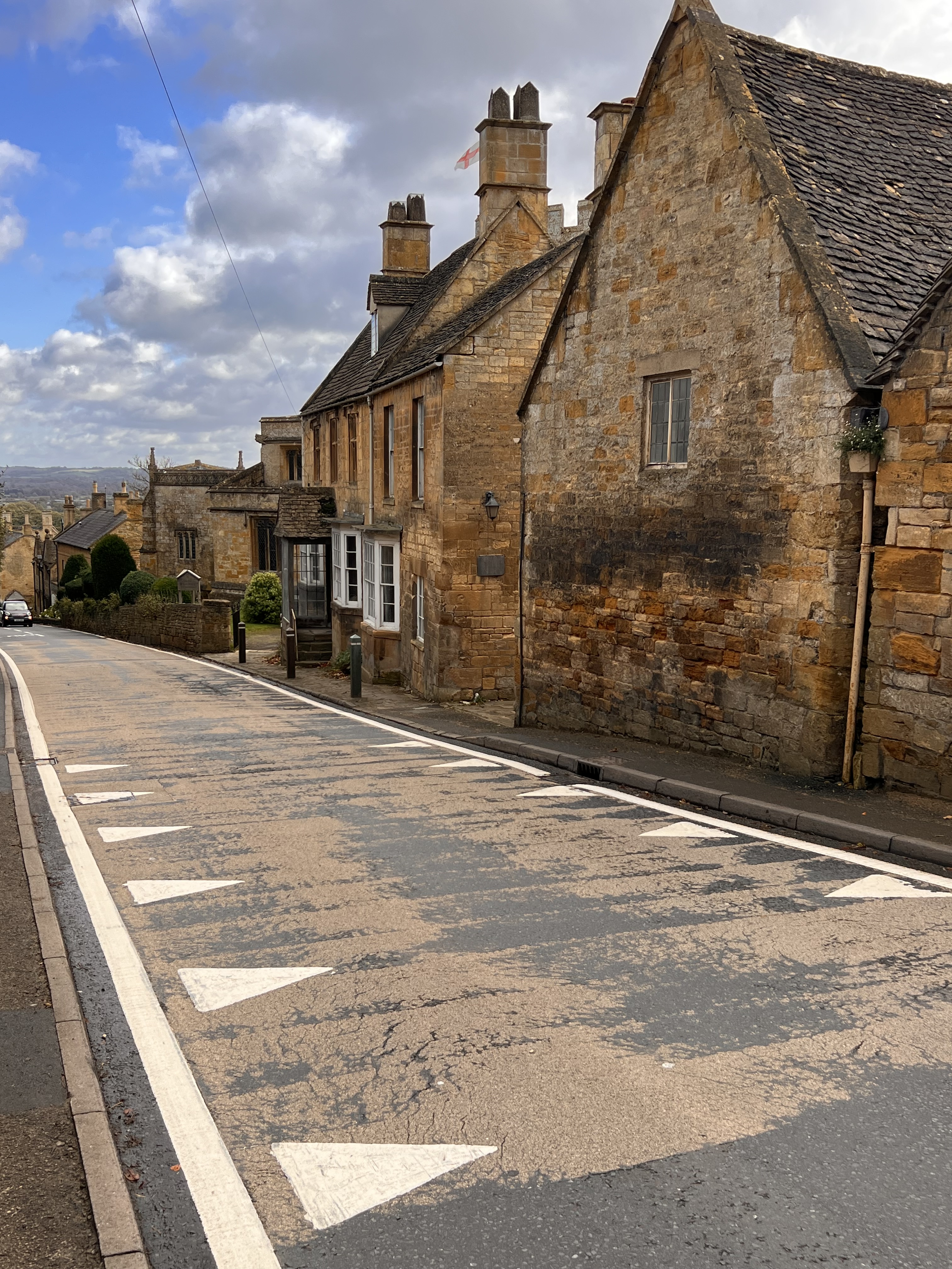
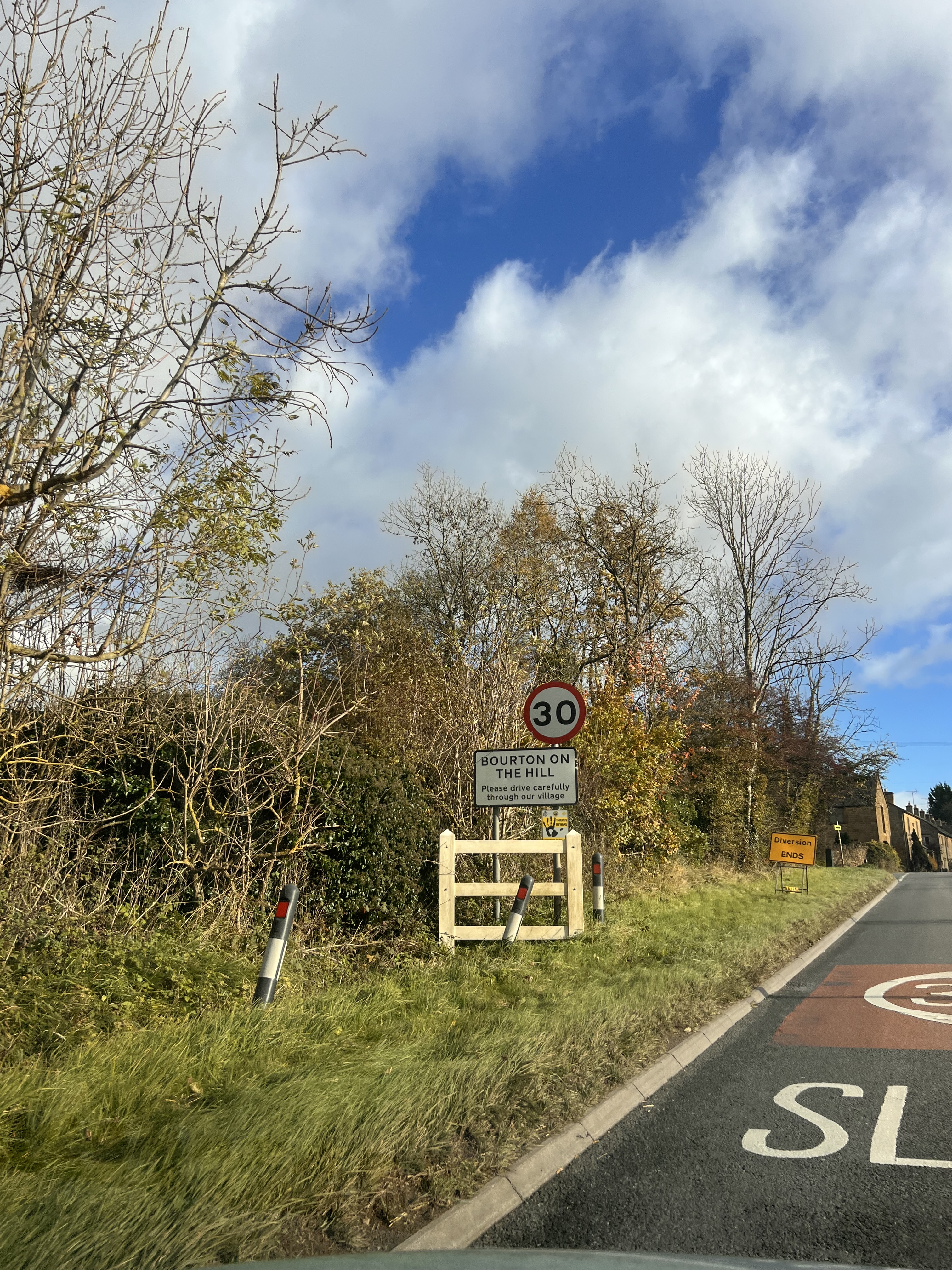
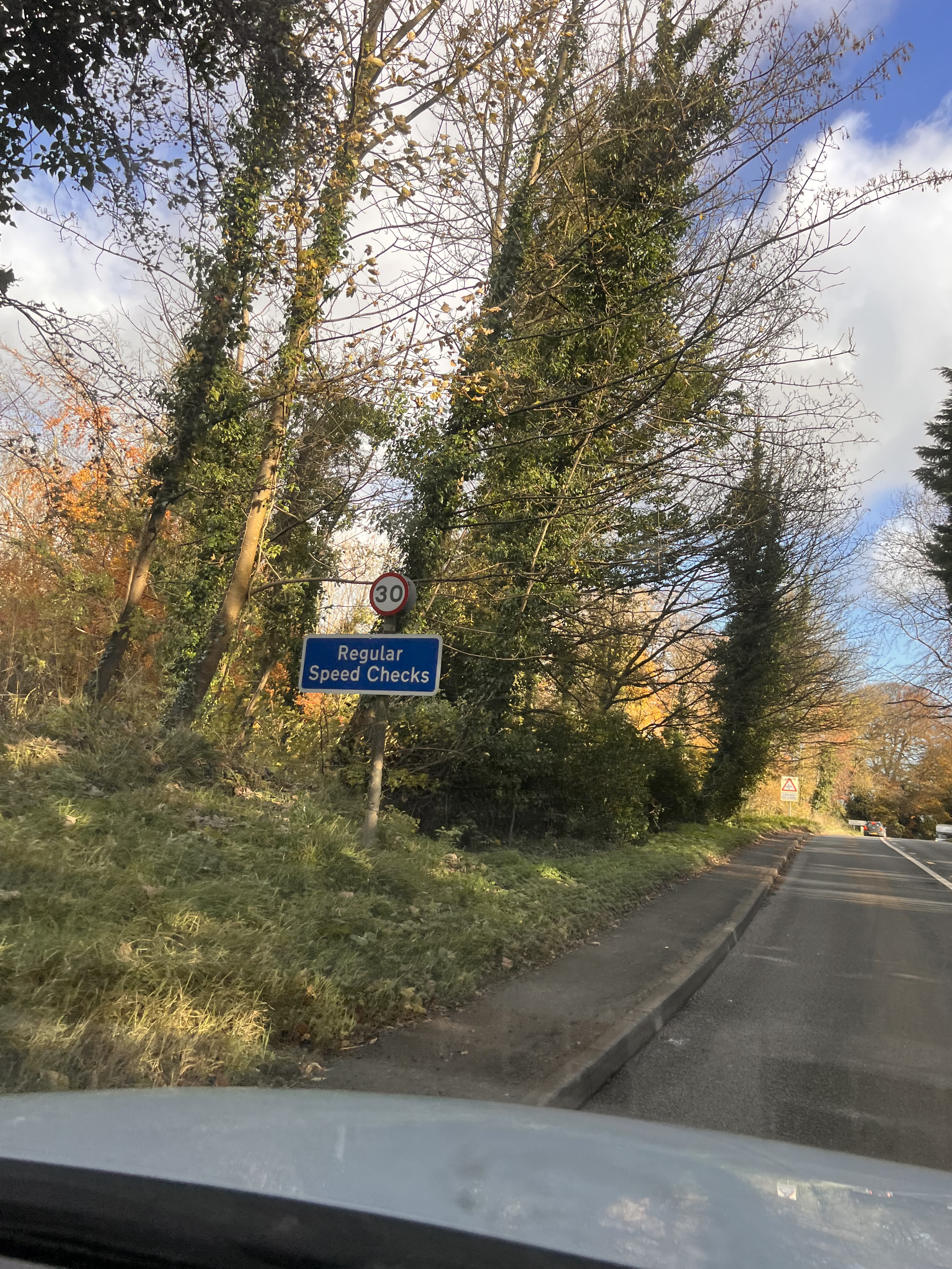
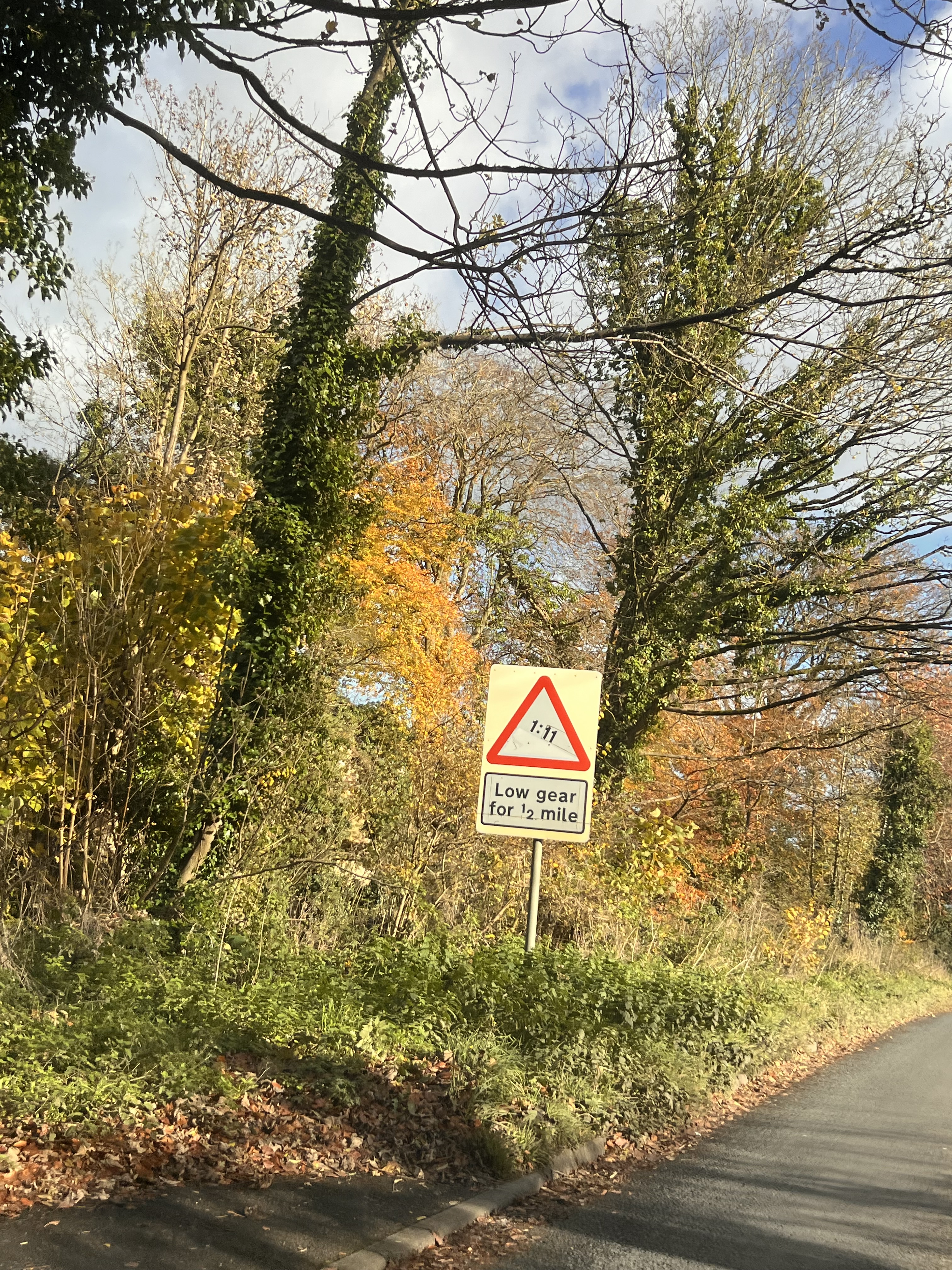
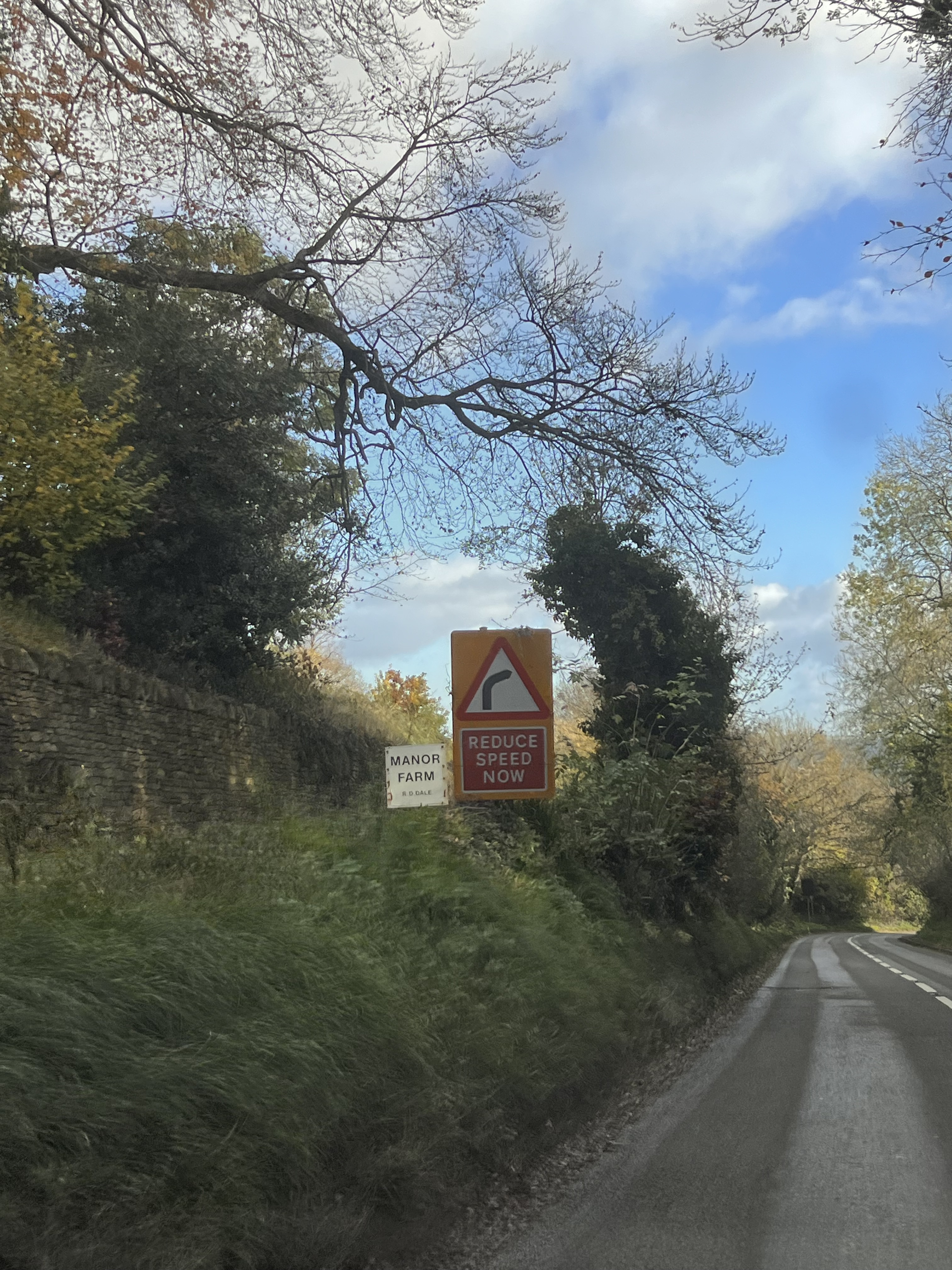
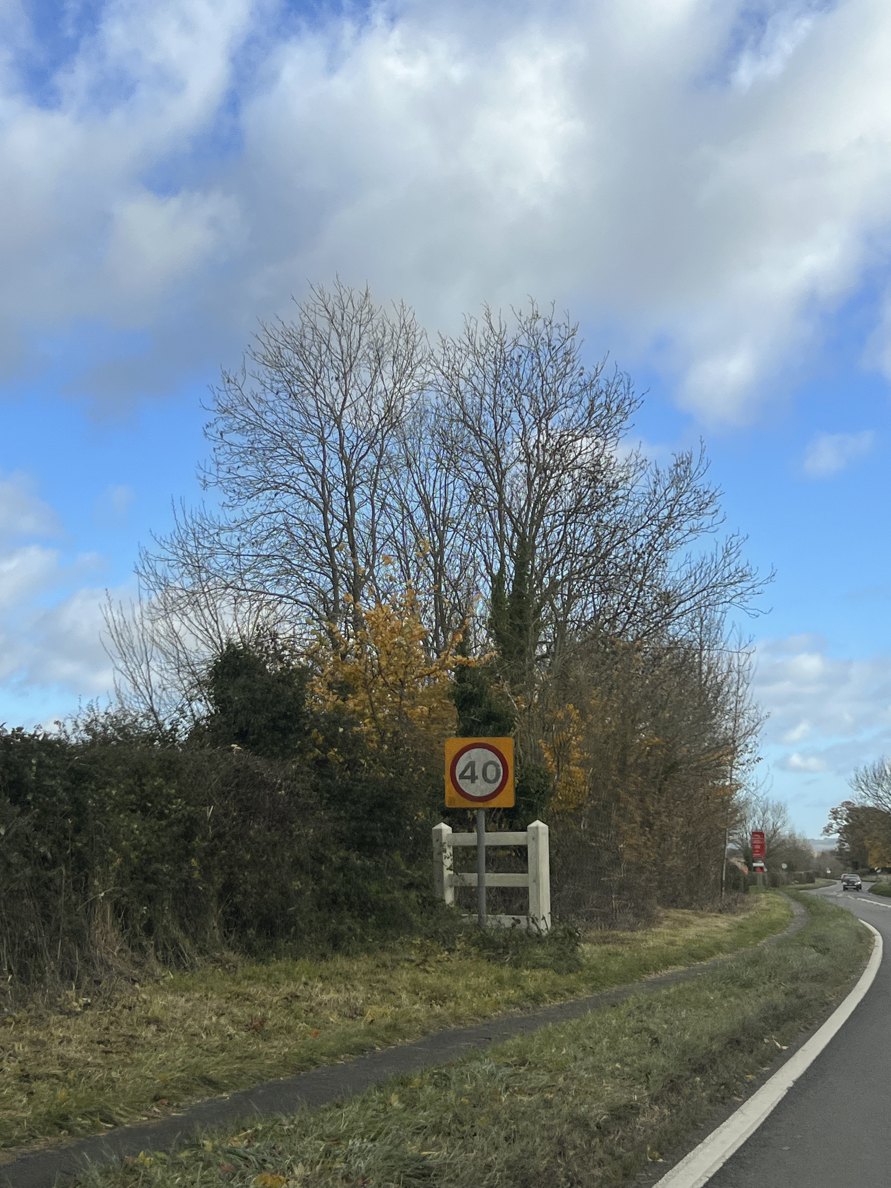
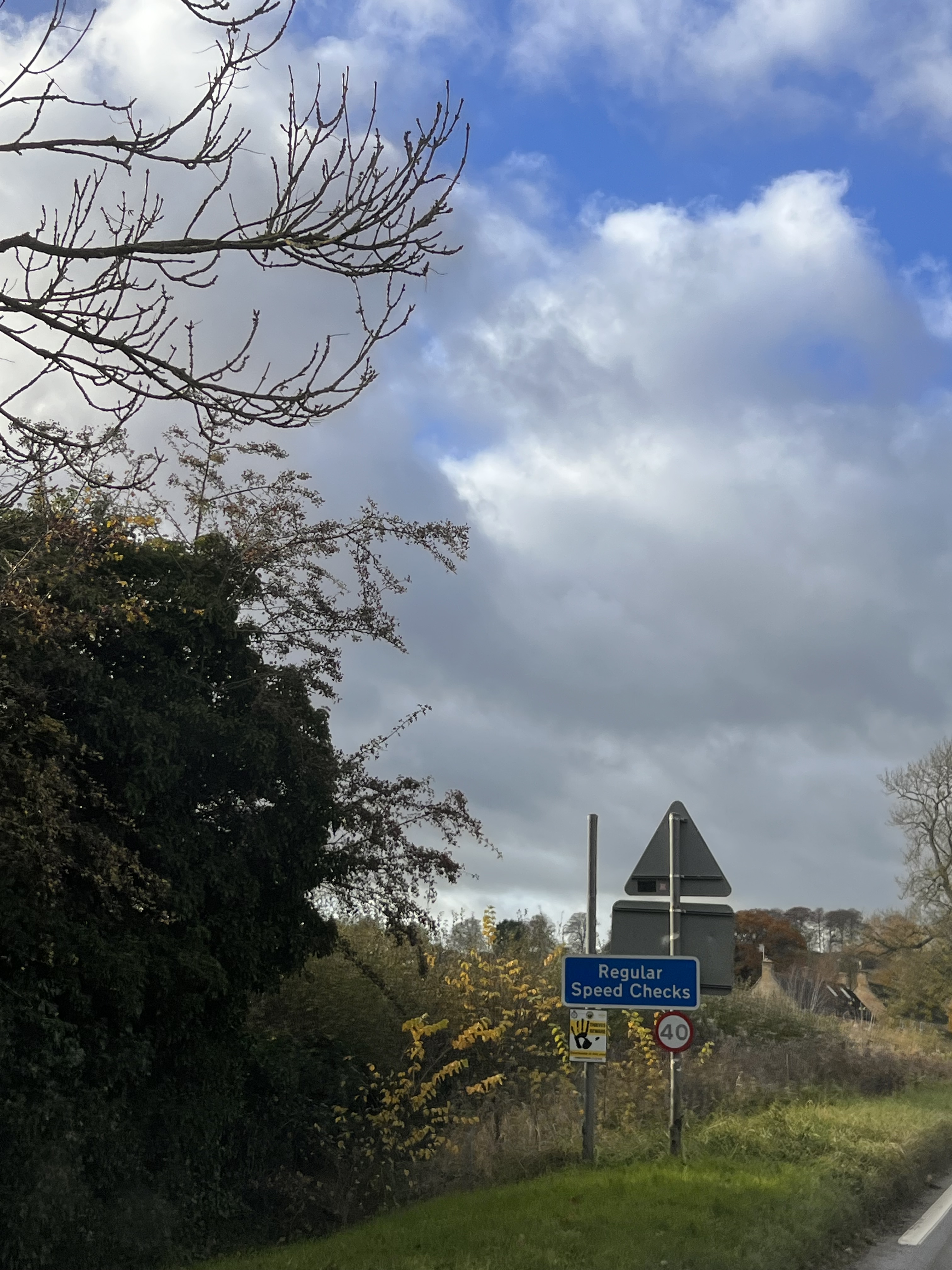
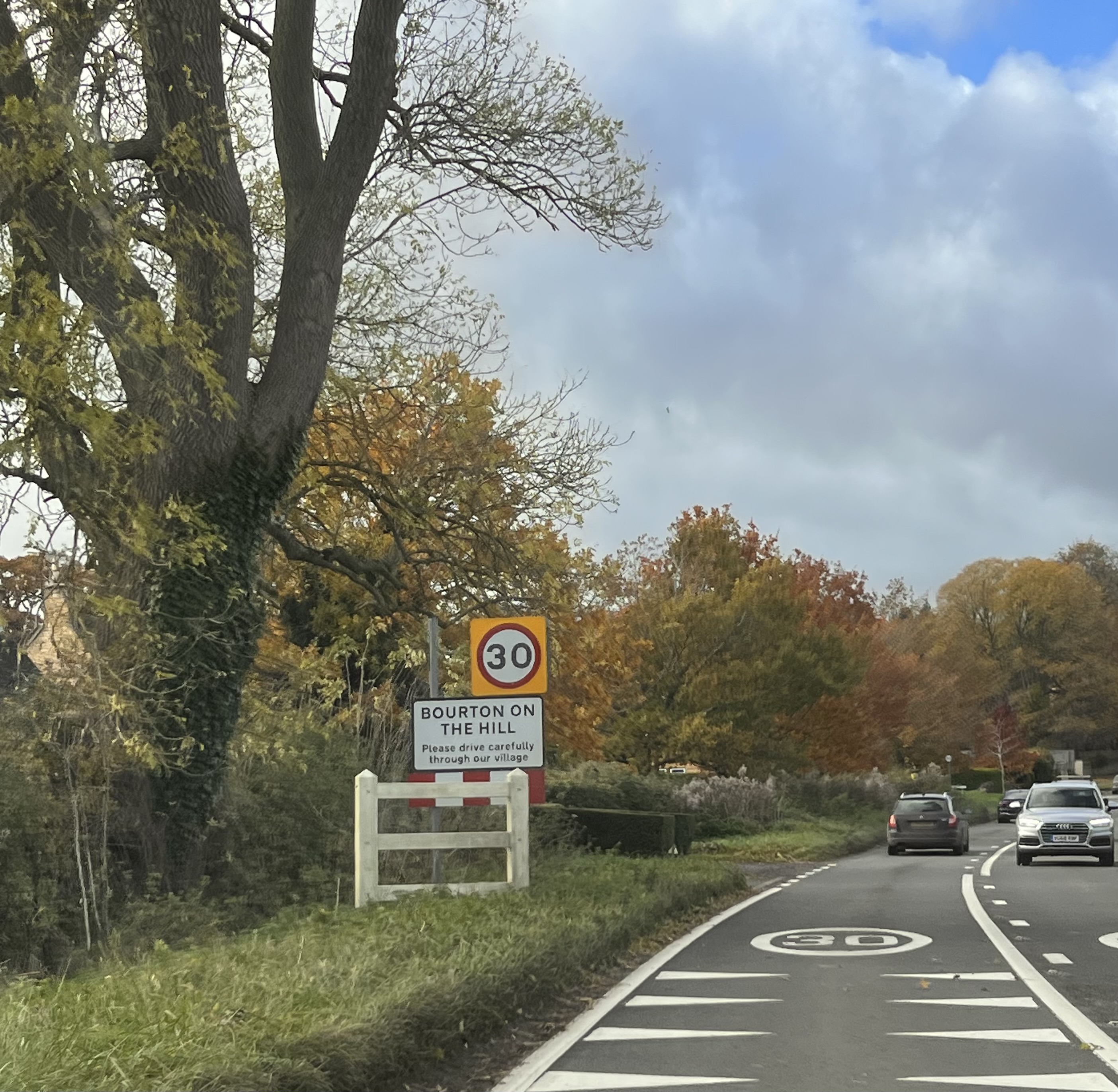
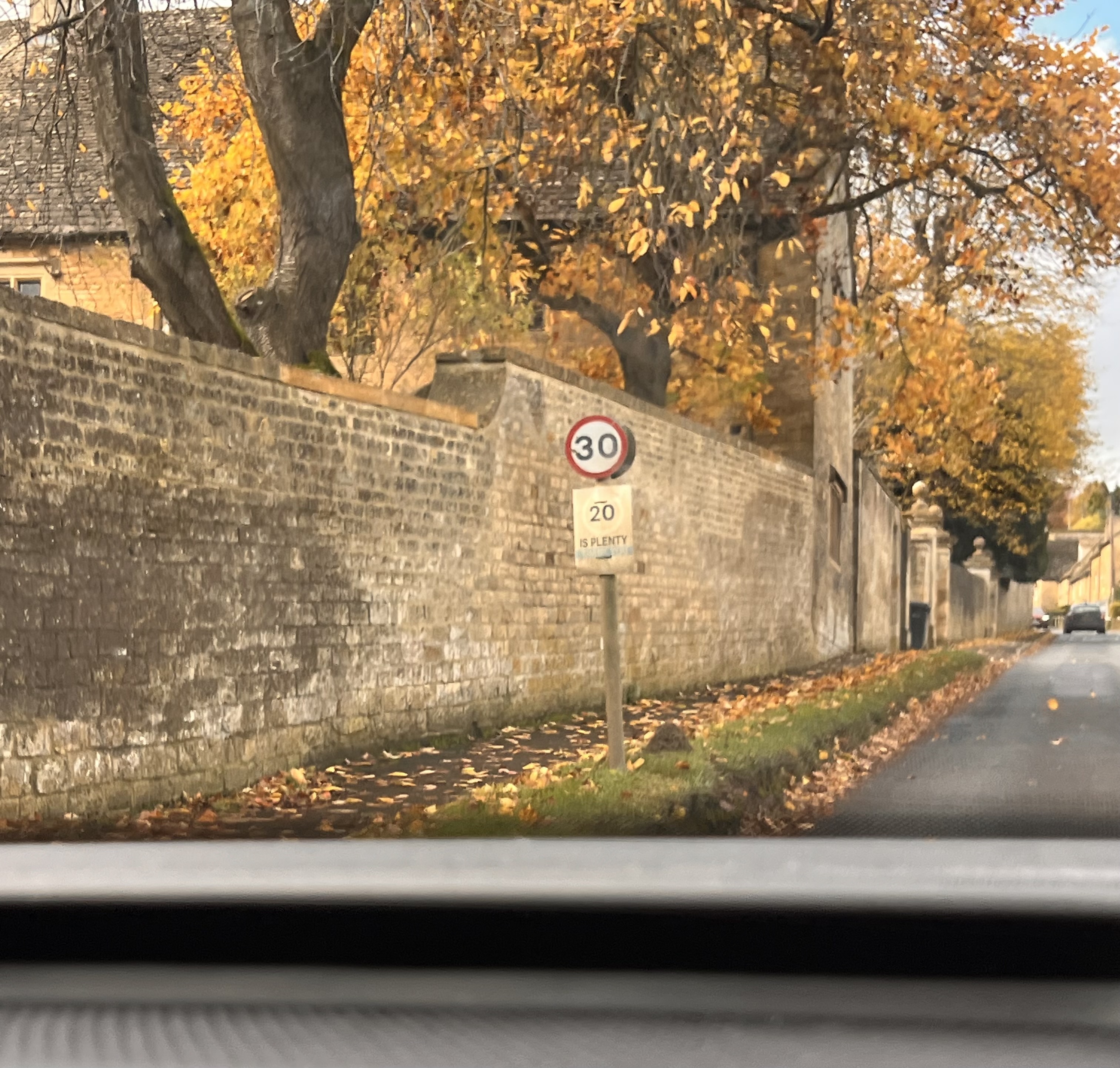
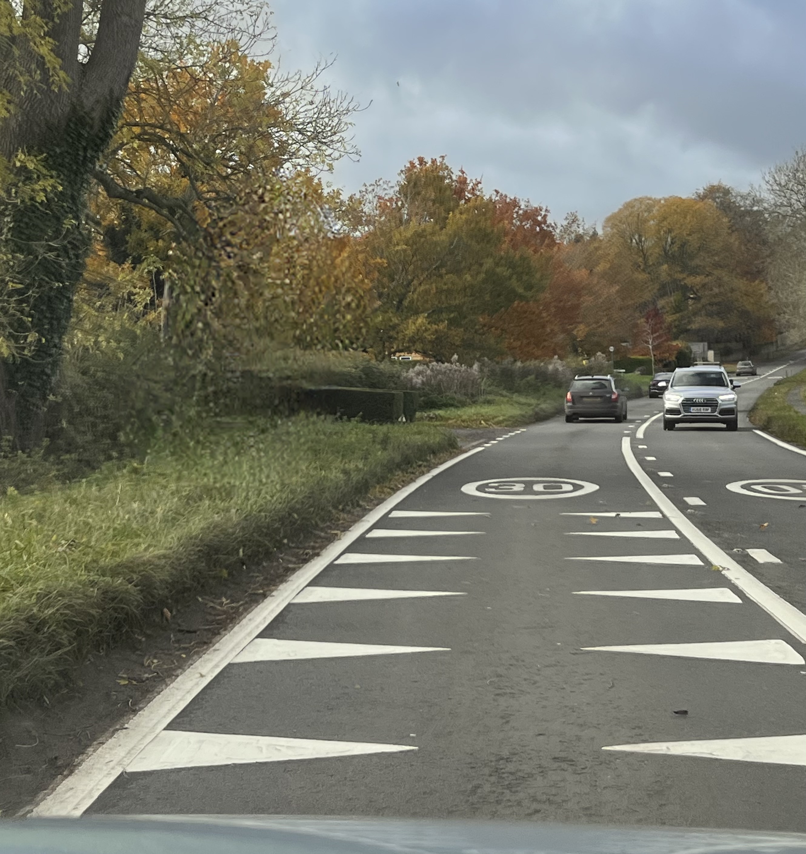
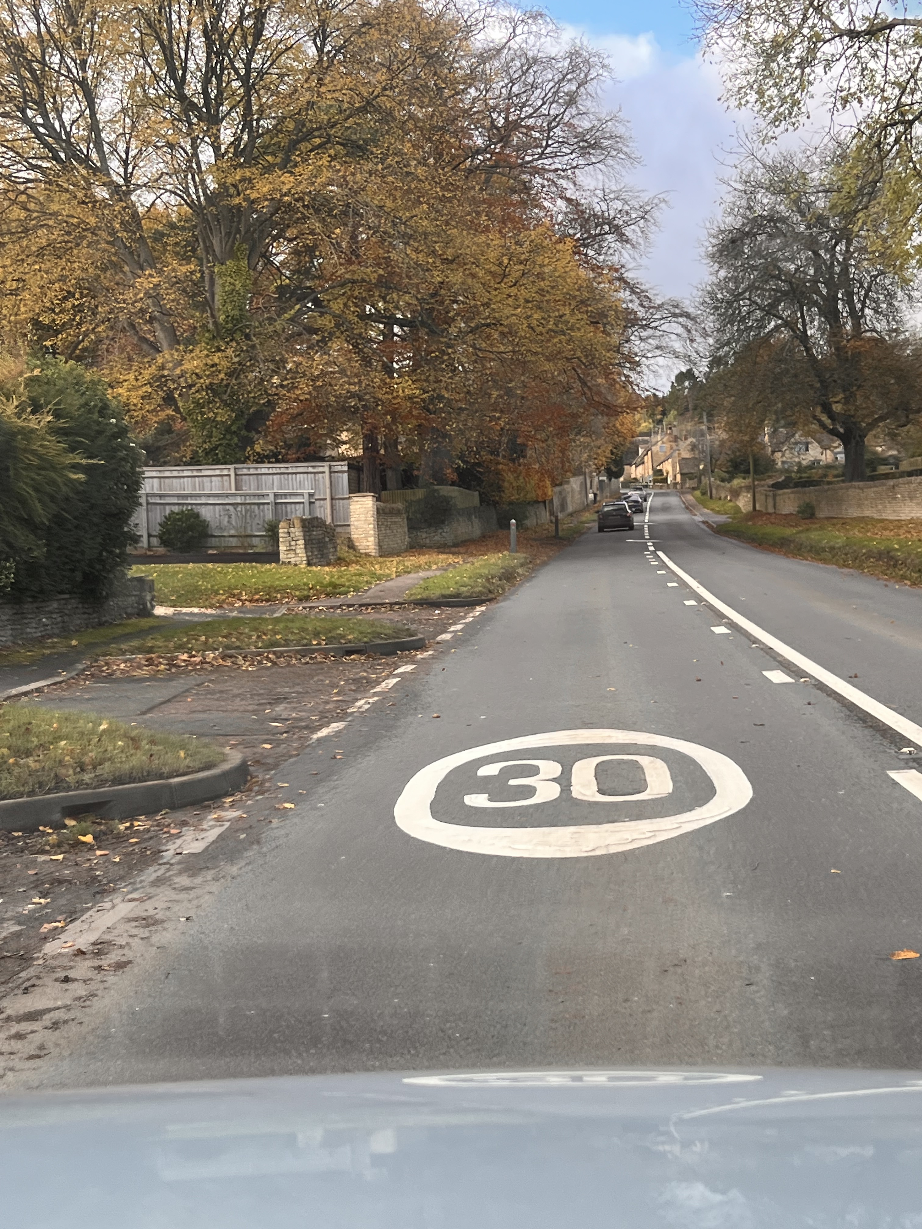
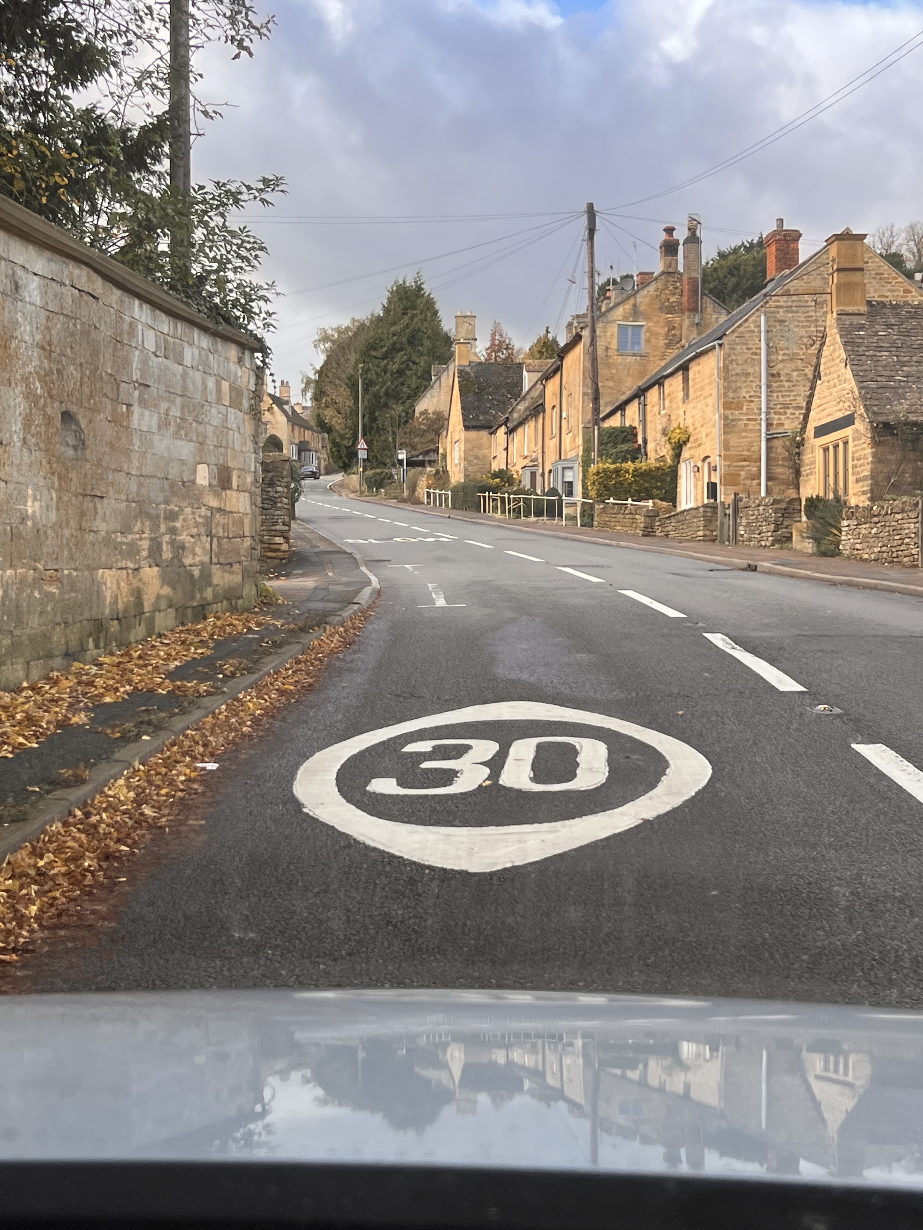
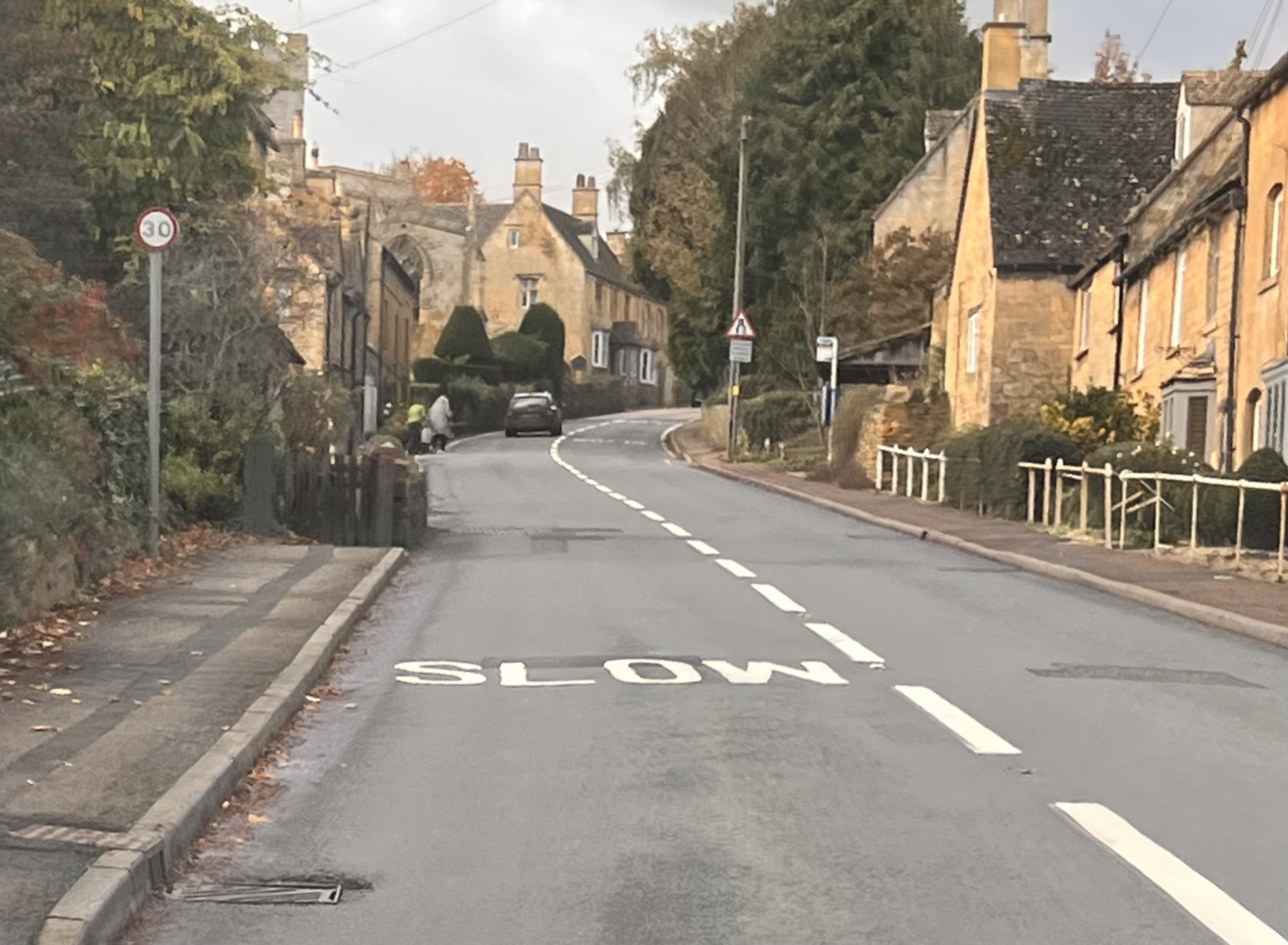
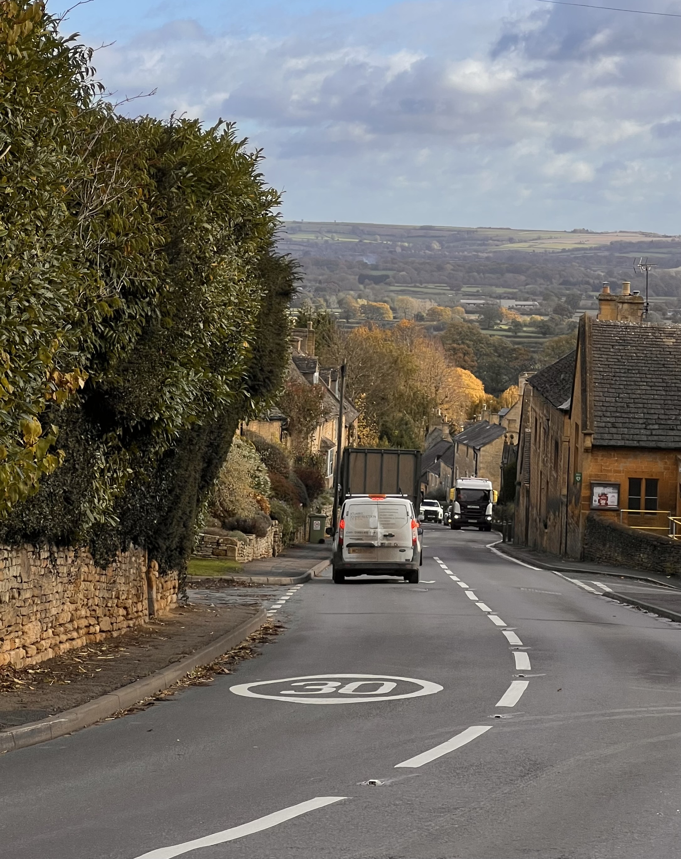
The images below show the existing road signs before and throughout Bourton On The Hill.
The images below show the speed awareness measures that are on the road throughout the village. As you can see there are 30 limits, SLOW and white crocodile teeth. All of which doesn’t help people to slow down through the village.
Reflection from Brief 1
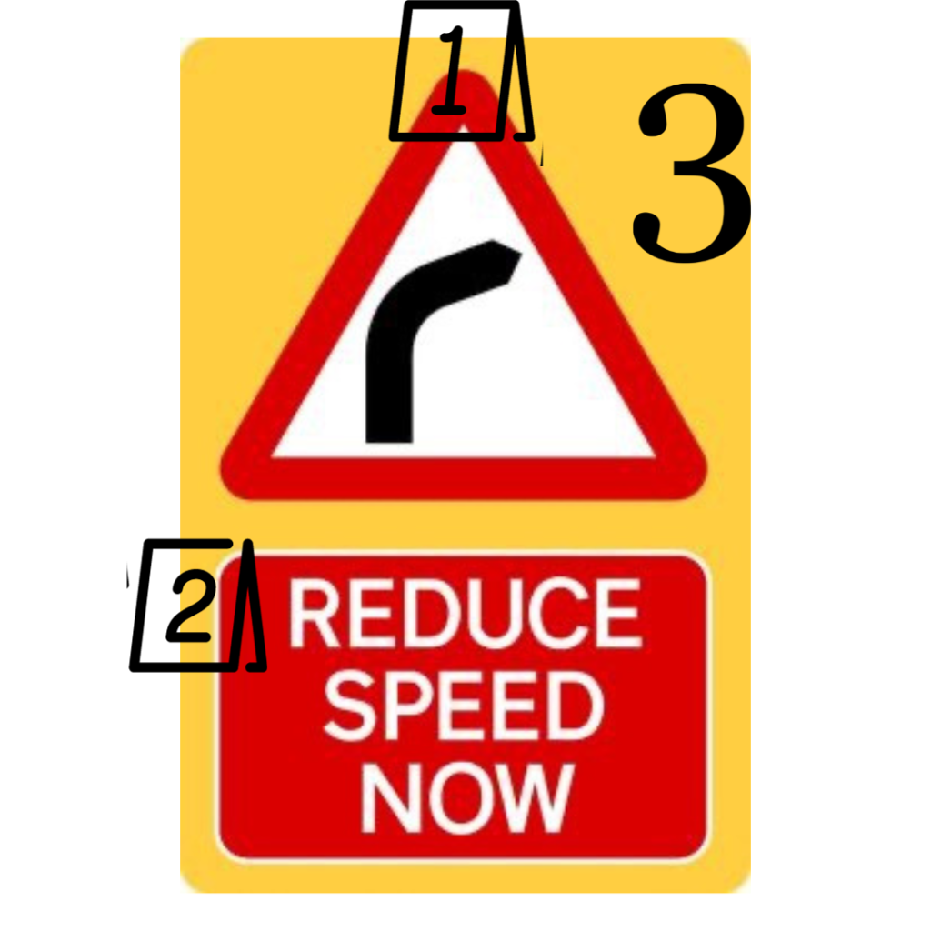
Using the same technique I used for my first brief which was about dissecting design to understand it I applied it to a road sign that I captured (an example above) so I could understand how the design works and why the law chose it to be used for communication.
The red triangle represents a hazard. This communicates to us that there is a risk coming up or something that could harm us. It’s there to make us take precautions.
The colour red is attention grabbing, so people will notice it and will be drawn to it. It visually communicates danger ahead.
The colour yellow represents caution, and draws your attention to it. It visually communicates hazards ahead.
Using yellow and red creates a bold sign that you can’t miss. The contrast between the colours makes you notice it.
Dissecting the above helps me to think about what colours are used and why.
One advertising campaign that I instantly thought of which stayed with me was an advertisement for pedestrians safety. The campaign was to raise awareness for pedestrians crossing.
They used a billboard to draw people’s attention to the issue of pedestrians crossing and relating to their safety.
At bus stops they placed digital signs at a bus stop (which was clever as thats how you would target a high population of people). They used a camera to record people’s body’s movements which shows them in X-Ray.
People can have fun watching themselves move around as a skeleton and then suddenly a car appears hitting them.
As you can from the image above the campaign started a conversation, it caught people off guard and got them thinking as they wasn’t expecting it. This effective campaign forces people to see a different perspective which they wouldn’t have seen before.
I watched a YouTube video which talks about whether the commercial took it too far.
The woman in the interview stated “It’s too much”, with one man. commenting on it saying “It’s a reality check”. I agree with the man. It is a reality check and the woman complaining about it’s too much…. it’s reality!
She said “I would of had a heart attack on the spot” which is hilarious because if that were real life and she was in that situation where she was crossing the road NOT at a crossing then she genuinely would of gone into shock or even death. So her making that comment about it being too much or how the commercial has gone too far…. that is the reality and the outcome of what will happen if you don’t cross at crossings.
I personally believe the ad is fit for the purpose. It does actually what an ad should do. It motivates and enhances the opportunity for change, it grabs your attention so you are hooked on what you are seeing and it’s getting a reaction from you – which in this case is for you to THINK. It shows you it can happen to anyone at any time.
The man commented on the location of where the billboard was set up and how effective it worked as the location that was chosen supports the message.
Another man commented “I think it’s brilliant, if it saves one life it’s done its purpose’. I hugely support this statement and agree with it, thats the purpose of an ad like this.
The same man said “sometimes messaging people will just not listen, sometimes you need to show them something so it’s so in their face that they will listen and we will talk about it”.
I thought this was a great way to stop cars and increase pedestrian road safety and I was wondering whether I could gain any inspiration from this innovation which would influence my idea for my speed awareness issue.
What I think works really well with this innovation is the information show on one of the yellow strip. It gives context to what the installation is about.
Following on from Quebec’s campaigns I came across the one below which is about road safety. This Ad I personally think is symbolic. The reason why I think this is the powerful message of silence. Using silence in the different scenarios which all link is effective.
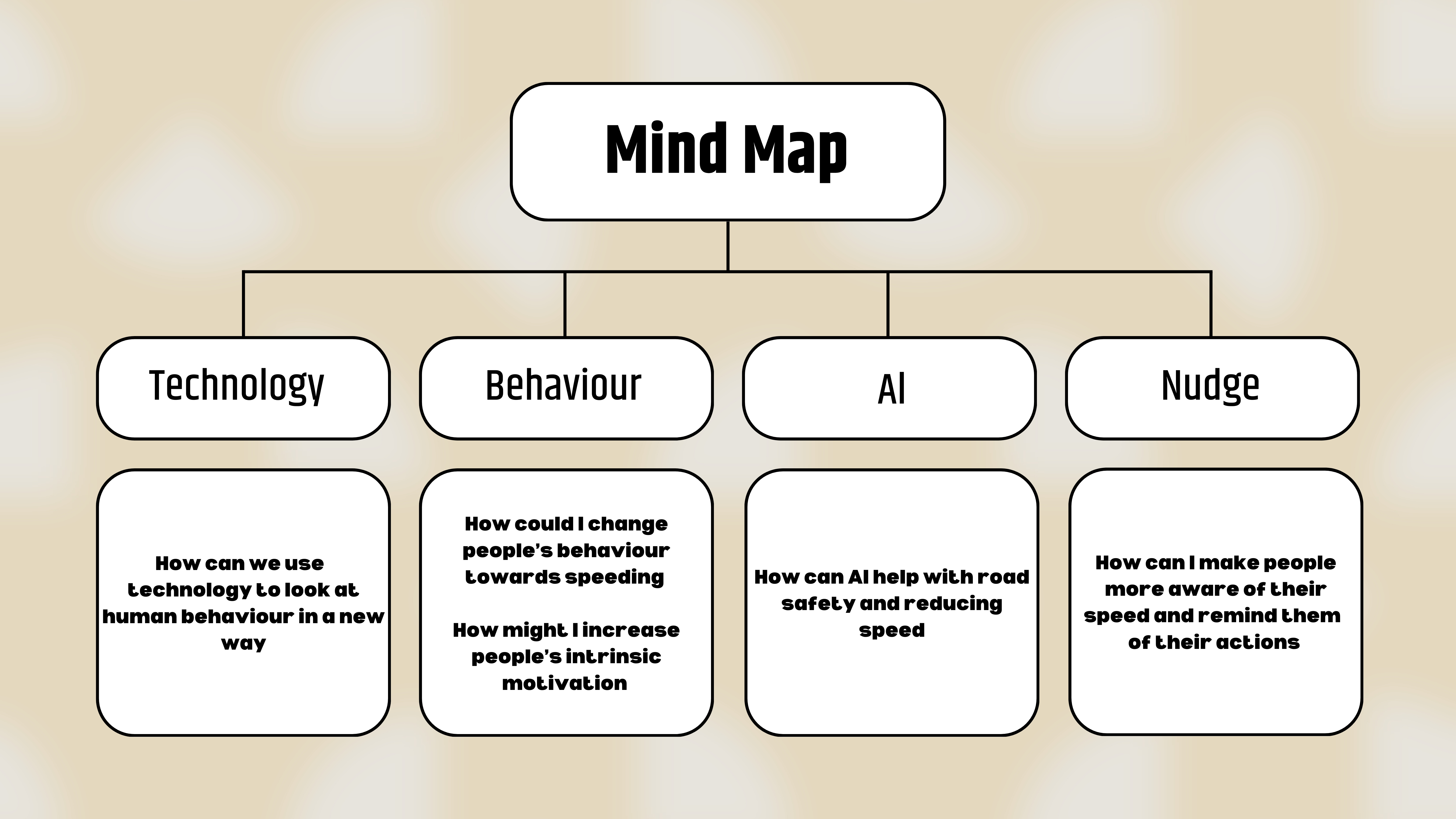
When looking into how I could target peoples behaviour and get people thinking about their speed instead of designing a controlling tool I needed to understand what can cause or affect people’s behaviour while driving.
I really like the illustration/image below because this is the approach I want to use whilst thinking about my project. How can I change drivers behaviour.
I noted down aspects that I could focus on relating to the perspectives I could approach speeding and think about design ideas which I could produce.
To ensure I am appropriately addressing the brief I searched the meaning of community.
What instantly came to mind was where I am from originally – The Cotswolds. Due to studying in Falmouth for my masters degree it didn’t seem right doing a community project here (in Falmouth) as I am not from here. The brief states ‘within your own community’
I used traffic colours to indicate the major issues and the less major issues. Starting at green (not a major issue) to red which is a main issue.
At the heart
We are asked to engage in user centred design research to identify a critical issue within my community in order to make it smarter, safer, healthier and more sustainable for everyone in it.
I thought this brief would be the perfect opportunity for me to give back to my community (village), the way I see it is when you are younger you don’t pay much attention to the world around you and even if you truly did there isn’t much you can do.
Now that I am older I appreciate the value of the village that I have lived in for my whole life and it is so important that nowadays we preserve these old villages. My village is so beautiful and it is ruined by fast, idiotic drivers.
The way that I see it now is now that I am older I would love to help and use my degree to help with issues in the village and do my part within Bourton On The hill community.
The main issue that arose when thinking about this brief was specifically the bend just before the turning of where I live. This issue is personal to me as throughout my driving experience t
No way is this car obeying the speed limit of 30mph down the village.
As you can see when pulling out of the ‘drive’ it is ridiculously hard to see what is coming, especially the speed in which cars travel. There have been several instances where I have pulled out, no car was travelling down the hill and then when I have looked into my front view mirror there has been a car so close to the back of my car. This shows how fast people come hurdling down the hill and it infuriates me. If drivers went 30 the people that pull out from this junction would be safer, we wouldn’t have to worry about a car crashing into us.
The image above shows what every car pulling out experiences, you can see how if a car pulls out and a car is speeding down the road the car pulling out could seriously get hit at speed and would defiantly flip over and the driver could be seriously injured.
This tractor is not going 30mph down the hill. Considering the village gets narrow (shown below) a really large vehicle speeding down is going to cause an accident or create traffic flow problems.
The tractor or any large vehicle speeding down the hill won’t know the village narrows, which is where awareness comes into it.
The video above shows that due to the narrowing of the road in the village it slows the traffic down when a large vehicle is passing through which demonstrates the importance of slowing down and obeying the speed limit so people can react in plenty of time.
My plan is to meet with the Chair of the Parish Council in Bourton On The Hill (Chris Priest) to gain a different perspective and just listen to the issues of speeding in the village and what the community is doing already to put things in place.
Are there factors that influence your working day? – transport, energy levels.
Empathy – putting yourself in someone else’s shoes. A chance to hate, to love. It’s about understanding. You have to understand the people you are designing for and seize the moment – jumping into someone’s situation / shoes.
Putting yourself in different scenarios and situations to understand a person.
Diabetes
Our client is called Ruth Irvine who is a Designer, Animator and Workshop Host who lives with Type 1 Diabetes. She works mostly remotely (in her home studio).
Interview
I made notes throughout the the interview on what she was saying so we had information to refer to.
I then input the information I gathered from the interview into a table which I could read and interpret easily.
The pump
Her career
Her history
What she concluded
At the end of the interview I asked her about whether she feels comfortable with her pump being shown as she previously spoke about how when people notice it they ask what it is.
I then mentioned about designs and cover ups that are available and her thoughts on those which she responded to due to her being a graphic designer she doesn’t like the designs
She commented on how the designs glamorise her healthcare and people don’t understand that because she has the worse type of diabetes which is Type 1. A lot of us know type 2 which is common but she expressed so many people aren’t educated on type 1.
Pump gets pulled out by accident and it moves which she finds hard to track and manage her glucose levels because of it.
“Help describe what it is without having to explain it”
Ruth Irvine
Class
Our class went around the room and chose three specific sentences/insights that they liked and thought would be good ideas.
Framing the Challenge
Insights and Key Themes
Known Unknown’s
Micro- Challenges
Client has type 1 diabetes
Diagnosed at 18 – had a bad experience at college
Used to rely on a needle to prick finger – now uses a pump
Diabetes type 1 – it can be a serious condition.
High blood sugar Damaging long term No energy Frequent urination
Low blood sugar – Vision blurry Shaky Unconscious
Creative process is affected – thinking (lack of focus), time management of projects, pressure (coming up with ideas and time management).
Hard to design for medical side effects of Type 1 diabetes.
Insight Statement
Ruth has to get back into range when she is not in a good condition
Reframe
How might we….
Help her to organise better so it takes the pressure off her and she can get back on track when she’s struggles to focus.
Broaden
How might we….
Refine
How might we….
Apps that help
Insight Statement
Ruth struggles with stacked up pressure from different situations
Reframe
How might we….
Help her to calm her mind.
Broaden
How might we….
Refine
How might we….
Scents or a comfort thing that helps her to become at ease
Insight Statement
Designs are glamorised
Reframe
How might we….
Make a design more practical and functional instead of aesthetics.
Broaden
How might we….
Refine
How might we….
Produce a design that is more functional – waterproof
Business card – disability idea
When looking into our ideas and how we could design an effective one we looked at existing ones that we could use as inspiration. All disability business cards are very formal and look like they resemble a drivers license or something similar.
We don’t want our business card to be formal as we believe 1) that isn’t what we want to achieve 2) that isn’t the ethos of Rue and what Rue explained to us, 3) we want to create a business card that is different, effective and hasn’t been created or thought about before.
After looking at examples I didn’t realise how common our idea was so I used our other idea about creating a slogan that I thought we could create an advertising campaign which we could relate/use with the business card.
Or we create a less serious one which is using brighter colours and more creative looking.
We found a great example that we wanted to take inspiration from and use to create our design. We thought this card was a great starting point or us when n thinking about what the card could show or communicate.
We really liked how it wasn’t formal, it looked easy to read and obtain information shown on it. We then from researching further that the card below was designed for children which makes sense as it looks less frightening and is a plain design but is effective for its use.
It draws less attention to the disability compared to the formal ones (in my personal opinion).
We also could use colours for moods which we then concluded that it was too complicated and the time frame that we had it would not be attainable.
King Wai (a peer I was working with though this project).
This gave me the idea of adding a QR code on the card which takes people to that disability emergency contacts if they require it without data. The QR code will resemble quick response code.
Using a barcode for emergency phone numbers provides people around an almost automatic way for them to get in contact with the disabled family members or friends.
Adding a phone icon within the middle of the barcode visually supports/communicates that the barcode will relate to a phone, which is a phone number.
We then concluded that we would turn the barcode into an educational form that would have more purpose and give clients context of Rue’s disability which would be more useful than a QR code for phone numbers.
Slogan options
1
Shine a Light on Invisible Diabetes: It’s Real, It’s Here, Let’s Make It Clear.
2
Invisible Disabilities: Visible Support
I like option 2 as it’s short, catchy and says exactly what we want it to say about what we are advocating for.
Final Concept
Business Cards
After talking about about invisible disabilities, one thing that I remember which I thought we could incorporate into the design of our business cards was a TED talk that Nile Wilson did (video shown below).
The beginning of this Ted talk was very empowering and I remember when I first saw it and how it impacted me, which has made me remembered it until this day. I watch a lot of YouTube videos and barely remember them but this one has always stuck out to me.
At the beginning of the video Nile Wilson introduced himself to everyone saying:
At the age of 20 I became an Olympic and World medalist multiple European World Campion, I was also responsible for the UK’s fastest growing Youtube channels which reached 1.5 million subscribers, 350 million views worldwide, using my platform I was able to build multi six figure businesses.
(Then he adds humour and says)
I am devilish good looking, super intelligent and an all top lad from Yorkshire.
(Which everyone whoops and starts to laugh with him)
Nile Wilson then states “Sorry I actually just want to restart that, I’ve missed a couple of important things out.”
Hello ladies and gentlemen, my name is Nile Wilson, I suffer badly from depression, I’ve broken my neck doing the sport that I love, I’m self destructive, competing at the highest level of sport I spent 4-5 nights a week in the casino alone. Once I drink alcohol I struggle to stop for days, even weeks at a time, I’ve been unfaithful to previous girlfriends, I smoke cigarettes, I struggle to eat and sleep and I am currently serving a 12 month driving ban.
Nile talks about how our strengths can become our weaknesses. I thought this really applied to our topic of invisible disability and our amazing client Rue. This is where our generic idea of using a business card really then explored further how we could make this a tool for Rue.
We wanted to let the card talk for Rue so she didn’t have to, this meant that we designed the card to show an example but it would be Rue that would choose what is shown on the card and what information she would use.
The business card opens up a conversation without anyone having to verbally saying anything which makes Rue feel more comfortable while allowing her clients to be aware of Rue’s disability and if Rue does need to step away for 10 minutes to sort her pump or lets say she requires to urinate more frequently then Rue doesn’t have to voice it and make her feel isolated, the card educates and gives knowledge to people so they can understand and Rue can be understood.
Exploring Rue’s website really gave us an insight into her personality but mainly her as a designer and the way she presents herself.
We used her website for colour schemes and realised the love that she has for puns.
We wanted to create up with a pun we could use as an example that supports her and her need for support and understanding.
One of our team members called King Wai came up with the pun/slogan:
Sorry I might take a Rue break
Our team
Adding a personal element on a card like this brings humour to the situation but also is acting as a purpose of insinuating what may need to be done.
Prototype
We wanted to isolate and bring attention to the “Rue break’ so we chose to use colour and isolate that sentence from the rest.
Overall our presentation went really well, the client (Rue) loved how we used aspects of her website and her passion for puns to incorporate personal aspects of her and provide her with ideas that she could use going forward with educating and informing others about her Type 1 diabetes.


